Table of contents
- Part 1: Definition
- Part 2: How to visualize layouts
- Part 3: How to create a box
- Part 4: How to activate flexbox
- Part 5: Justify-content
- Part 6: Align-items
- Part 7: Flex-direction
- Part 8: Flex-wrap
- Part 9: Real-life examples
Definition
CSS Flexbox is used to create layouts on a web page. In this tutorial, you will learn about parent containers, how to visualize containers, flexbox properties, and see real-life examples.
How to visualize layouts
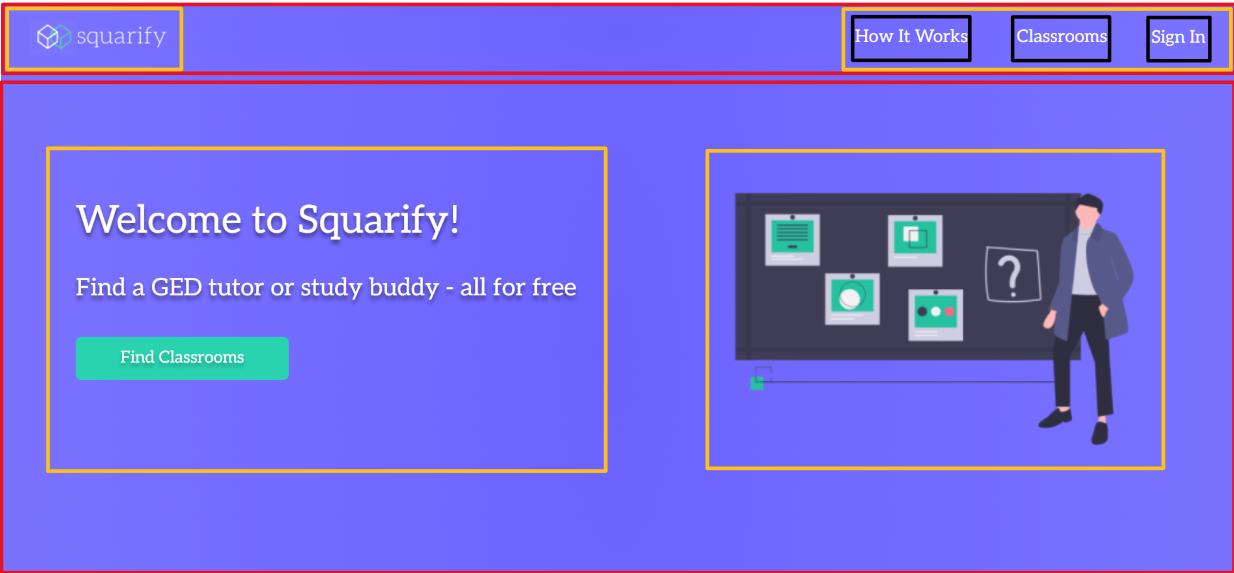
When I look at a website, I think of the website as a box in a box within another box. Think of divs as a container or a box. There are some examples below. The red box represents the parent container, yellow box represents child container, and the black box represents grand-child container.


How to create a box
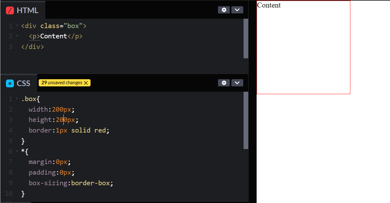
Creating a box is important to visualize how flexbox works. It requires a div, height, width and border.

How to activate flexbox
To activate flexbox, you would use the command display:flex; on CSS. Display flex only works on the parent container and it only affects its direct children, but not its grandchildren. One of the biggest mistakes that I see is that developers put display flex on the element itself but not on the parent container.
What is display:flex
By default, elements go vertically. Display flex allows elements to go horizontally.


